Feature: Expense Insights

Understand Your Spending, Unlock Savings

Go beyond a simple list of transactions. Monsy’s insights turn your spending data into clear, actionable knowledge to help you save more and spend smarter.

An analytics dashboard showing expense charts and insights.

Find the "Why" Behind Your Spending

Your financial data tells a story. We help you read it. Uncover patterns, trends, and opportunities you might have missed.

  • Categorical Breakdown

    Quickly see which categories you spend the most on with a clear, colorful pie chart that visualizes your habits.

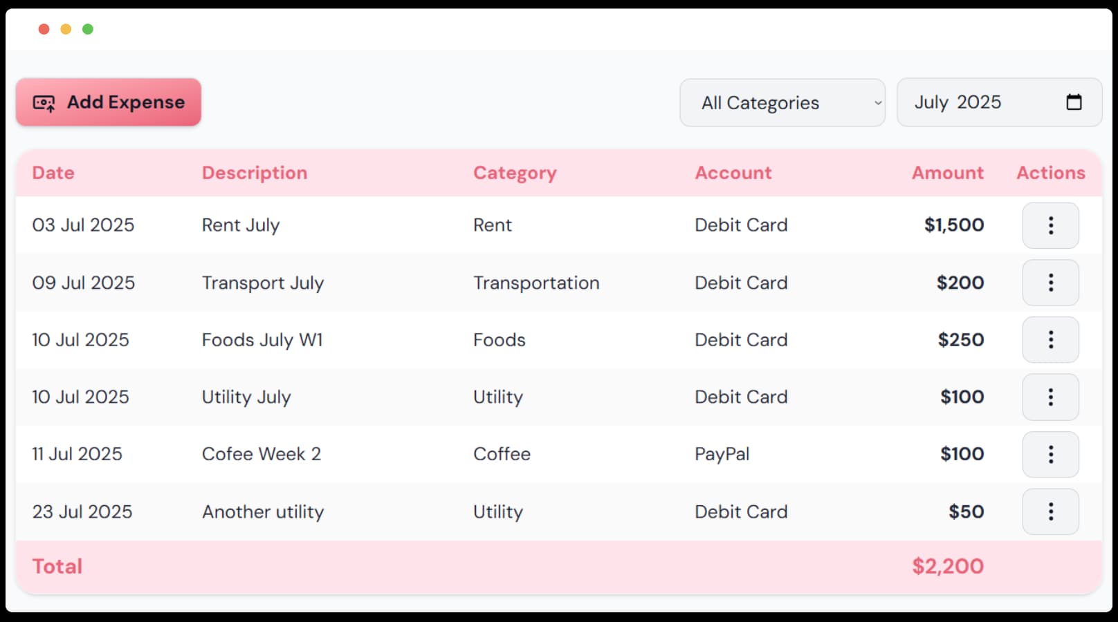
  • Filter by Time Period

    Drill down into your data. Filter expenses by month and year to get the specific answers you need about your spending.

  • Track Monthly Spending

    Monitor your expenses month-over-month to see trends, spot irregularities, and understand your financial rhythm.

Detailed charts showing spending breakdowns by category and time.

From Raw Data to Real Knowledge

We don't just show you numbers; we provide context. See how this month's spending compares to last month, or how your habits change over the year.

  • Monthly Comparisons: See if your spending in a category is increasing or decreasing.
  • Category Deep Dive: View all transactions for a single category to understand the details.
  • Detailed Transaction Lists: See every single expense that makes up a category total for the month.
Charts comparing spending across different time periods.

Why Monsy's Insights Empower You

Data-Driven Clarity
Transform your transaction list into powerful, easy-to-understand charts. See your financial story unfold visually.
Discover Savings
Identify your top spending categories and pinpoint exactly where you can cut back to accelerate your savings.
Answer Key Questions
Find out how much you spend on groceries or subscriptions per month with powerful filtering and search.

Expense Insights Questions Answered

Get the details on how Monsy helps you understand your money.
When you add or edit a transaction, you can assign it to a category you've created. This manual classification ensures your spending insights are always accurate and organized just the way you like.
The expenses page includes filters that let you select a specific month and year. The charts and transaction lists will automatically update to show you insights for that chosen period.
The pie chart provides a visual breakdown of your spending by category for the selected time period. It's a great way to see at a glance where the largest portions of your money are going.
By showing you exactly where your money is going, insights empower you to make informed decisions. When you see that you're spending 20% of your income on dining out, it becomes much easier to create a realistic budget and find areas to cut back.

Ready to Make Smarter Financial Decisions?

Knowledge is power. Sign up for free and let Monsy illuminate your financial habits and help you find savings.

Get Started for Free